I gave my website a boss fight
I missed an internet with more personality. Building a little piece of it involved Claude, 4,096 colors, and a surprisingly difficult pair of legs.
I missed an internet with more personality. Building a little piece of it involved Claude, 4,096 colors, and a surprisingly difficult pair of legs.
My personal website now has a monster called Jirasaurus. It attacks with Scope Creep and Sprint Planning. Halfway through the fight, it performs a Workflow Migration.
This is still the website where you can read my blog and find my email address.
I miss the old internet. I miss landing on someone's website and getting a sense of the person who made it. Their interests, their sense of humor, the things they cared enough about to spend an unreasonable amount of time on. So much of the web now feels bland and bleak by comparison.
And my own site was playing it safe. I'd spent all this time teaching Impeccable how to be more creative, then left my personal website looking perfectly respectable and a bit boring.
It was time to go all in. I wanted people to enjoy spending time there. To get drawn into something, find a surprise, and come away feeling like they'd visited my corner of the internet. I thought about what I wanted that visit to feel like before getting into what we should build.
So I opened Claude Code and asked for something “extremely over the top.” Ten days later, there was a boss fight.
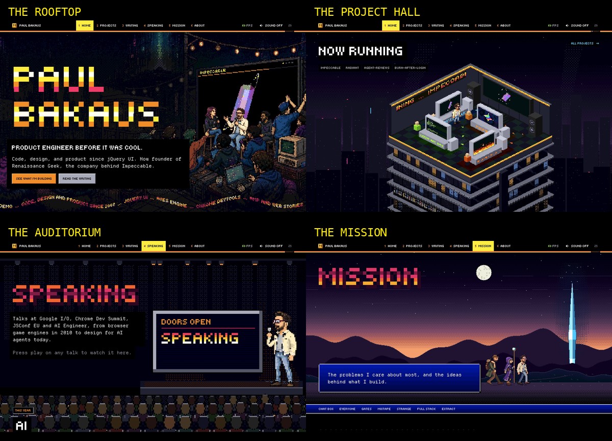
The result is a little world rendered live in your browser. My projects occupy a solar system. My writing lives on floppy disks. There's a rooftop panel above a city, a road through my career, and a speaking page where my talks play on the screen of a pixel-art auditorium. Three pages hide playable games.
Underneath all of it, Ghost still publishes the posts and sends the newsletter. The whole thing ships as a theme zip.
Let me show you how we got here, including the bits that went spectacularly wrong.
The experience starts before you get there
One experience I keep coming back to is Secret Cinema in London. I went to their production of The Empire Strikes Back, and the immersion started as soon as I'd booked. Emails arrived that treated me as someone who belonged in the story. I was already participating before I got to the venue.
That whole production made a huge impression on me. Ever since, when I organize an event or build something, I find myself thinking about the experience from the very first contact. What someone encounters on the way in matters. So does what happens between the big moments.
I'm a little obsessed with this. I want to get absorbed in a place, and I love creating that feeling for other people.
For this site, I started with how I wanted people to relate to me. I wanted them to spend time in a world that reflected my interests and sense of humor. Even my frustrations could become something we enjoyed together. If you've ever had your day swallowed by meetings and process, there's something satisfying about jumping over a meeting invitation.
That gave the redesign a direction. The scenes, the music, and the way you move between pages all contribute to the same visit.
Giving that world a personal point of view
One early hero put my portrait over a forest. It was attractive, but I couldn't see myself in it. My feedback was simple: “it doesn't really have anything to do with me.”
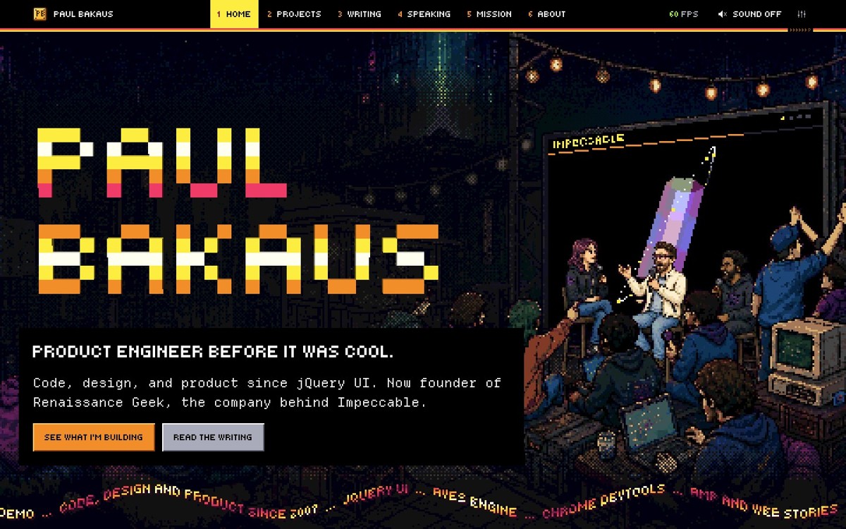
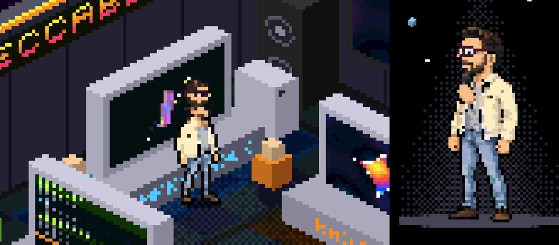
The forest became a rooftop hack night. I'm on a panel, wearing my cream jacket, with a city behind me and a crowd in front. That's a much more specific introduction to someone who spends a lot of his time building things and talking about them.
That became a useful test for the rest of the site. Each scene had to tell you something about me, and give you a reason to spend a little time with it.
The career timeline became a road with milestone billboards. On the speaking page, choosing a talk dims the house lights and plays the video on the stage's big screen. The mission page turns the problems I care about into monsters you can fight.
The demoscene gave us a way to make these ideas belong together. A demo is a real-time audiovisual production; a megademo strings several parts together. My site already had parts. We gave each one a scene and a tune, then built the machinery to travel between them.
First, take away most of the colors
“Retro” leaves a lot open to interpretation. We needed rules precise enough to make decisions with.
The site's world uses the Amiga's 4,096-color palette: sixteen levels each of red, green, and blue. Edges stay hard. Gradients become stepped bands of color. Shading uses patterns of pixels. Nothing glows.
Most of the scenes are drawn into small Canvas 2D buffers, then enlarged by whole-number scales. One source pixel becomes a square block of screen pixels. The voxel logo uses WebGL2, but it follows the same visual direction.
These constraints do a lot of the work. A rooftop, a spaceship, and an office can be wildly different subjects and still look as though they came out of the same machine.
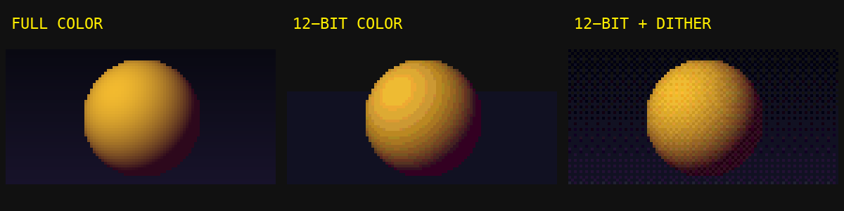
Look closely at a shaded area. The intermediate tone comes from alternating pixels in a repeating pattern. That's ordered dithering. Zoom out and your eye blends the pattern; zoom in and you can see the construction.
This gave Claude something concrete to preserve across iterations. “Make it feel more retro” could go almost anywhere. A fixed palette, a pixel grid, and an approved reference gave us a shared target.
Teaching myself to walk
I've worked in the video game industry and built a game engine before, so sprites are familiar territory. I approach an animation thinking about its playback rate, the work that has to fit inside each frame, and where the character should be from one frame to the next. Those decisions shape how you build it.
Turning me into a sprite started with a photograph: dark hair, burgundy glasses, short beard, cream jacket. Image-model explorations helped us choose a direction, then the approved artwork was reduced onto a real pixel grid and into the site's palette.
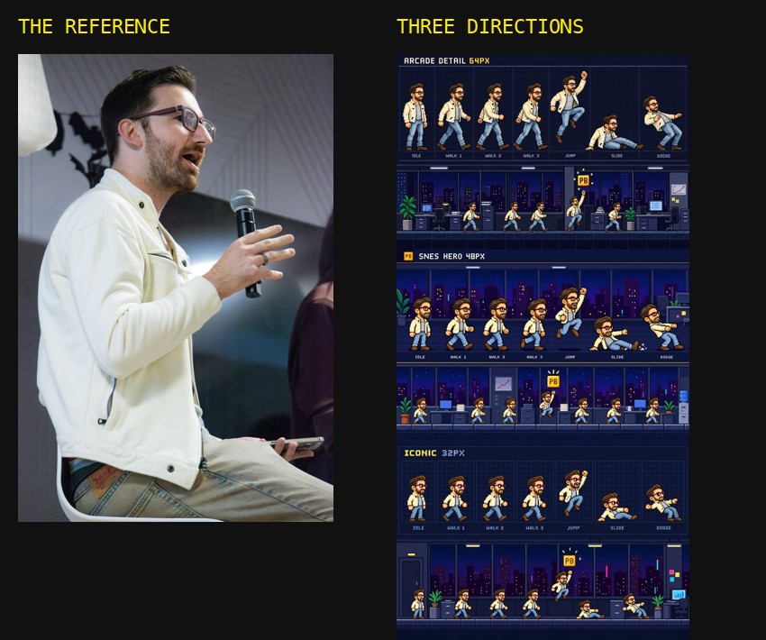
Getting a recognizable little person was manageable. Getting him to walk was an ordeal.
Individual frames looked plausible. In motion, I squished, slid, or hopped forward. Some iterations wandered away from the character I'd already approved. At one point my feedback was: “in this sprite, I now have three hands.”
The walking problem needed a different method. Claude built a rig that kept the approved head and torso and calculated the legs as two connected bones. The boots pivoted around the heel or toe. The animation followed the phases of an actual step, and the movement of the ground matched the stride.
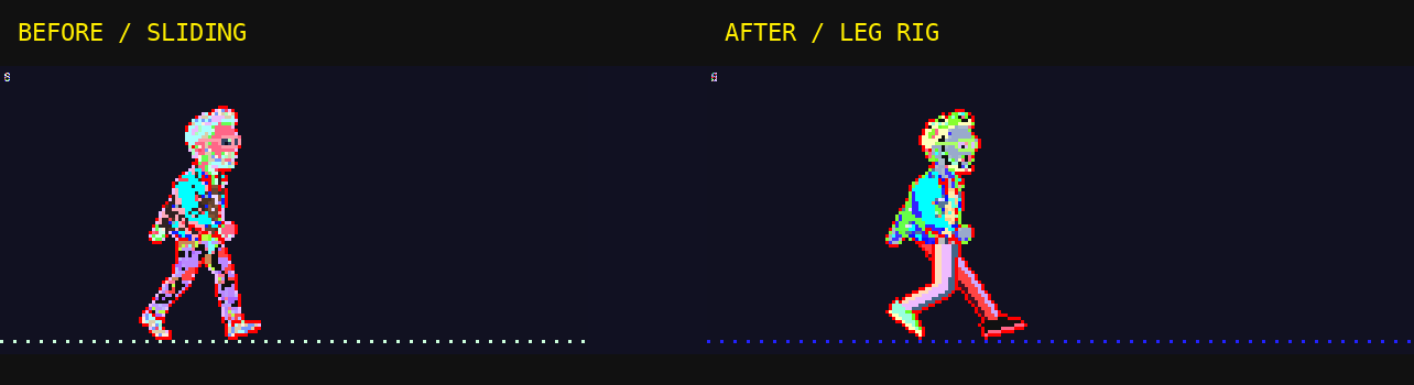
The foot is the giveaway. While it's planted, it needs to stay attached to its spot on the floor. If the scenery and the animation disagree, you feel the mistake immediately, even if you couldn't explain the math behind it.
We started checking the walks as animations at their actual timing. A screenshot had been answering the wrong question. Claude could produce the code and imagery quickly, but its visual understanding wasn't reliably catching what happened between those plausible frames. My experience made the mistakes easy to recognize; we still needed a process that caught and corrected them.
That's something I'd run into while building Radiant, too. An effect can survive a code review and look convincing in a still image, then fall apart when you watch it run.
The browser plays the soundtrack
The music is synthesized live with Web Audio. The site's soundtrack and effects don't come from recordings: oscillators, noise, filters, and envelopes make the sounds as you hear them.
There are twelve tunes in the shipped site. Arriving at them involved a lot of listening.
We built a local sounds lab where I could rate candidates and leave notes. Across 95 candidates, I marked ten “love,” 26 “maybe,” and 59 “no.” My notes contain a remarkable number of variations on “weak melody.”
The arrangements could sound pleasant while leaving me with nothing to remember. The lab made it possible to compare directions, explain what was missing, and return to the ones worth developing.
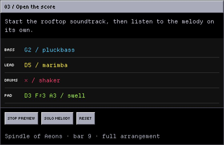
The finished site has a hidden studio that exposes this machinery: notes arriving in a tracker view, scopes, mute and solo controls. You can listen to the parts separately. There's also a tool that turns a hummed melody into notes and arranges a backing underneath it, all processed in the browser.
The soundtrack also shaped navigation. A normal page load would interrupt it, so the theme fetches the next page behind a closing shutter, swaps the main content, and starts the new scene. The audio context and song clock stay alive. Tunes can change at a bar boundary.
A link click becomes a scene change. The music carries you through it. This is exactly the kind of in-between moment I care about: you should still feel inside the world while moving to another part of it.
A blog header gets out of hand
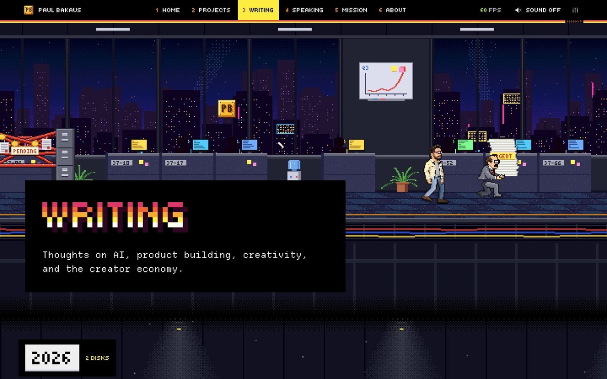
The writing page takes place on Floor 37, an office where a small version of me dodges meeting invitations, jumps onto an URGENT stack of work, and slides under red tape.
Click the scene and it grows into a playable platformer. You have a working day to collect floppy disks and get through the office. Leaving the game shrinks it back into the page where you started.
The mission page grew a battle system. The speaking page gained Keynote, a rhythm game about delivering a talk: advance the slides, hold for the laughs, recover when the live demo crashes. Claude proposed that last one, and it fit the page well enough to build.
The games carry the same subjects as the pages around them. Floor 37 makes bureaucracy literal. Keynote lets you experience a talk from the other end of the clicker. Jirasaurus is probably self-explanatory to anyone who has survived a workflow migration. They're a way to share a frustration and have a laugh about it together. You get to know something about me by playing.
This was the feeling I wanted to bring back: you click something because it looks interesting, and discover that someone cared enough to make it do something delightful.
They also stay optional. You can come for a post, read it, and leave without fighting anything.
It still has to be a website
A site can look spectacular in a design-awards gallery and still be frustrating to use. I wanted people to get absorbed in this one, but someone arriving to read a blog post should be able to just read the blog post.
An early version had a boot screen in front of the site. It fit the aesthetic. It also made you get through an interstitial before you could do what you came for, and I generally dislike interstitials.
We removed it. A brief nudge now points at the sound control. The site opens immediately, and sound stays off until you choose it.
Thinking about the whole visit also means noticing when you're making it harder for someone to enjoy themselves. An elaborate entrance can wear out its welcome before they've even reached the site.
Titles, descriptions, and links remain real HTML. The canvases draw around them. Reduced motion gets still scenes and immediate transitions. Scenes stop drawing when they're off screen, and games load separately from the pages that contain them.
Responsive design was a big part of this. The experience had to hold together across screen sizes, including the awkward ones. A phone turned sideways gives you a very different space to work with from a tall desktop window.
Try opening the homepage on a desktop and resizing the browser. Watch the rooftop as the window gets narrower. The browser redraws the scene for the space it has, adjusting its framing along with the page layout. At narrower sizes, the rooftop becomes a window onto the panel, with the title and copy arranged around it. Further down, the project hall gives way to individually presented monitors.
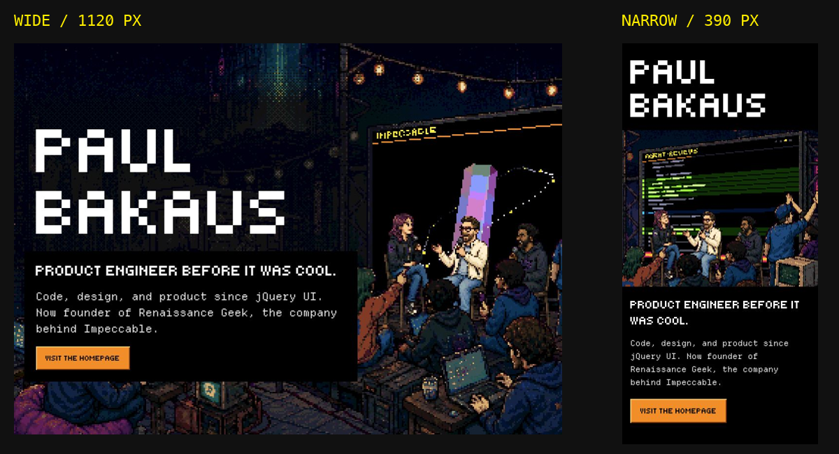
There's a nice technical detail here. When a canvas changes size, the engine recalculates its drawing buffer and lets the scene respond to the new dimensions. In the narrow rooftop view, the layout and renderer share a whole-number pixel scale, so the framing can change while the pixels stay crisp. The page is deciding how to present the same world in the available space.
That took real attention. The spectacle only works if you can still see what matters and reach what you came for, on the screen you're actually using.
The new scene engine is plain JavaScript and CSS inside a Ghost theme. There is no framework or development build step. Packaging a release minifies a copy of the assets, then produces the zip I upload through Ghost Admin.
Even with a ticket-management kaiju in it, the publishing workflow is familiar.
What working with Claude actually looked like
Claude wrote the code, built the art pipeline, and composed the music. I supplied direction, chose between versions, and used the thing repeatedly on my laptop and phone.
Most of my feedback came in batches: this doesn't feel like me; that walk is wrong; this tune needs a stronger melody; the phone layout is hiding something; let's see whether this scene could be playable.
Claude ran browser checks and automated playthroughs. Those were useful for catching broken behavior. They couldn't settle whether a tune was memorable or a character's walk felt natural.
The sprite work makes the tradeoff especially clear. Building those animations myself, I would have accounted for timing and motion from the start and avoided much of that particular rework. Producing all the art, code, and variations by hand would also have taken me much longer.
Working with Claude gave me very fast production and experimentation, with less reliable first attempts in areas like animation. The short feedback cycles were how I made use of that speed. I could try a direction, watch it fail, explain exactly what was wrong, and try again while the idea was still fresh. Knowing how the underlying system should work helped me decide when another iteration was worthwhile and when we needed to change the method entirely, as we did with the walk rig.
We also had to protect decisions we'd already made. A later “polish” pass could drift away from an approved design. One made the Impeccable diamond look like a strawberry. We restored the version that worked.
The practical lesson for me was to keep the references close, make feedback specific, and review each thing in the form people would experience it. Listen to the music. Watch the walk. Try the site on a phone. Keep the good version around so “better” has something to be compared against.
AI made an absurd amount of this feasible over the course of ten calendar days. My part was deciding what belonged on my website, and then being quite particular about it.
What stayed with me after Secret Cinema was the feeling of having spent time inside another world. That's the feeling I'm reaching for here, on the scale of a personal website. I hope you come away having enjoyed yourself, with a better sense of the person who built it. Possibly also a high score.
Go have a look. Turn the sound on if you can. And if you visit Floor 37, try clicking the scene.